You are using an out of date browser. It may not display this or other websites correctly.
You should upgrade or use an alternative browser.
You should upgrade or use an alternative browser.
Adventures In Texture Editing
- Thread starter Grinkles
- Start date
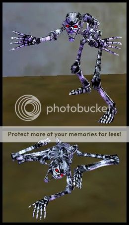
Lightning/Storm Elemental imo. Dark clouds and a flash of light in the middle.
Good thinking! Imagine these baddies lurking through the trees of Emerald Jungle instead of the generic air elementals that are there now.
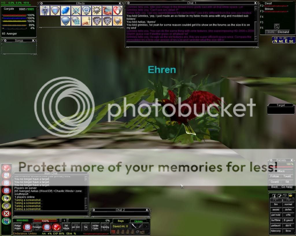
which file was for the ranger bird? I poked around a bit but didn't find it.
The Ranger bird is stored in brv.s3d, which presumably stands for blood raven. Therein you'll find the .dds texture images for editing. This is the format used for almost all post-Luclin images, as far as I have seen. It seems to allow for higher-quality images and even non-rectangular shapes with improved transparency (no more magic pink).
You can find this kind of thing out for yourself by opening, say, felwithea_chr.txt and doing some guesswork with the non-global models loaded for each zone. Sure enough, you'll see the line brv,brv_chr. This means the blood raven is being pulled to that zone on top of felwithea's normal mob roster, as it is not technically global.
Could be that the brv texture is cached in every single zone individually since it is pulled to every zone instead of being a proper global model. Try deleting those zone texture caches and see if it fixes the issue? It may simply be an impractical thing to be testing out if you're the type of person whose PC performance relies heavily on texture caching in the first place. I turned texture caching off simply because I got tired of having to delete those extra files every time I wanted to test how something looked in the game.
Mythryn
Dalayan Master
If you're interested, the old EQEmu Guidebook has pictures and texture numbers for most (if not all) of the models/textures that SoD uses. It also has a bunch of other junk that isn't relevant to anyone anymore!
Here's a copy omg.
Here's a copy omg.
JesusPrice
Dalayan Adventurer
Grinkles..... Can you make zombies black or white? Green elephants like Babar's suit
mechkl
Dalayan Elder
I would be more than happy to put up custom skins if:
A) They are polished and do not stick out.
B) They are thematically appropriate.
C) They do not override textures that we use a lot.
Keep posting cool shit!
awwww i never got this offer u lucky duck... rip random derpasaur
Is your loading screen splash artwork broken for Shards of Dalaya? Does it stretch and cut off where it isn't supposed to? I'm looking for volunteers to try a fix on their own machines. I managed to get the loading art working 100% fine at all resolutions on my own computer, but Waldoff tells me that the stretching and cutoff are not the same for everyone. That said, would some of you please try downloading this ~600 KB file and replacing the one by the same name in your EQ SoD directory? You may want to make a copy of the old one just to be safe prior to doing the overwrite.
Would really appreciate feedback on this from those willing to give it a go! (Hopefully the Google Drive link works, because this is the first time I've tried using it.)
The fix worked for me.
CURRENT OFFERINGS:
[*]A fix for the loading splash page issue where some computers display the loading screen askew or cut off. 300 fame.
I believe some fame is due.
JesusPrice
Dalayan Adventurer
very nice indeed
Admin-Tao himself told me in the game that he would like to see this:
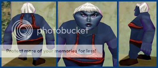
Note that the Dark Elf ears are nowhere in sight because the Ogre model does not have such ears in its wireframe. Also note in the second picture how the bra straps end abruptly before fully covering the shoulder. This is because the Ogre has a vastly different set of pixel references in its model compared to the petite Dark Elf. The two 3D models have totally different "seams" between their polygons, which results in irregularities when superimposing the one race's texture over the other. (Similar mismatches can be seen between the nose of the Dark Elf textures versus the nose of the Ogre wireframe, or in the poorly-matched seam under a waving arm--see the images below.) In short, the Dark Elf art was not drawn to accommodate the Ogre's shape.
A similar issue happens below the torso, and it took me about 15 minutes of manipulating the texture's groin area before it would show up more or less properly on the Ogre. Firstly, I should say that all of the .bmp images used in classic races are of identical proportions within each texture piece. All heads across all races and genders are 64 pixels by 64 pixels, all upper arms are 32 pixels by 64 pixels, and so on. The .bmp image for the Dark Elf female's panties (which is categorized as part of the legs) uses a relatively natural shape when applied to the 3D wireframe, and it is easy to see where the crotch is, where the rear end is, etc. This shape is mirrored over the Y axis in-game to give perfect symmetry and complete both halves of the model. This method cuts down on resources used by the client while simultaneously lightening the load of the artists and developers. The female Ogre's wireframe, however, does not share the graceful, easy-to-follow shape of the female Dark Elf, and the Ogre's own artwork is rather distorted and hard to follow in order to accommodate the Ogre's lovable lumps and curves. Anyway, the short end of it is that I could not get the strap underneath the body to line up, though it could be done if a person were terribly inclined. Direct your eyes to the groin of the second image below and you will see what I mean:
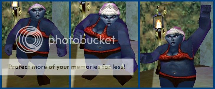
Does anyone else agree that the navel piercing really adds to the aesthetic appeal of this combination? :toot:

Note that the Dark Elf ears are nowhere in sight because the Ogre model does not have such ears in its wireframe. Also note in the second picture how the bra straps end abruptly before fully covering the shoulder. This is because the Ogre has a vastly different set of pixel references in its model compared to the petite Dark Elf. The two 3D models have totally different "seams" between their polygons, which results in irregularities when superimposing the one race's texture over the other. (Similar mismatches can be seen between the nose of the Dark Elf textures versus the nose of the Ogre wireframe, or in the poorly-matched seam under a waving arm--see the images below.) In short, the Dark Elf art was not drawn to accommodate the Ogre's shape.
A similar issue happens below the torso, and it took me about 15 minutes of manipulating the texture's groin area before it would show up more or less properly on the Ogre. Firstly, I should say that all of the .bmp images used in classic races are of identical proportions within each texture piece. All heads across all races and genders are 64 pixels by 64 pixels, all upper arms are 32 pixels by 64 pixels, and so on. The .bmp image for the Dark Elf female's panties (which is categorized as part of the legs) uses a relatively natural shape when applied to the 3D wireframe, and it is easy to see where the crotch is, where the rear end is, etc. This shape is mirrored over the Y axis in-game to give perfect symmetry and complete both halves of the model. This method cuts down on resources used by the client while simultaneously lightening the load of the artists and developers. The female Ogre's wireframe, however, does not share the graceful, easy-to-follow shape of the female Dark Elf, and the Ogre's own artwork is rather distorted and hard to follow in order to accommodate the Ogre's lovable lumps and curves. Anyway, the short end of it is that I could not get the strap underneath the body to line up, though it could be done if a person were terribly inclined. Direct your eyes to the groin of the second image below and you will see what I mean:

Does anyone else agree that the navel piercing really adds to the aesthetic appeal of this combination? :toot:
Last edited:
Dinadass
Dalayan Pious Diety
it took me about 15 minutes of manipulating the texture's groin area
Grinkles I think it's time you stop and think about how you're spending your free time. We're getting worried, man.
RobbyBenson24
Dalayan Elder
Looks kinda like the girl from Pitch Perfect.
Thats hilarious
Daffie
Dalayan Pious Diety
Grinkles I think it's time you stop and think about how you're spending your free time. We're getting worried, man.
Realistic groin areas are important!
