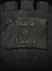
SoD Icon

SoD Icon (V2.0)

Green? Shows up as gold on my screen... hmm, doing an outline on text is kind hard at the lower resolutions (32x32 and 16x16). I'll see what I can come up with, but no promises I can make it work.

Keep the suggestions and thoughts coming!
 
Last edited:
*dives back into the image editing software to double check his RGB values*

Anyone else confirm this?

Definitely green.

Anyway, I'm just gonna throw this out there and see what people think... "Shards of Dalaya" is a mouthful for any desktop icon. Why not bring it back to "SoD"? You could dress it up nicer because more room, fix any contrast problems, it is in place currently and if people can't figure it out we don't want them playing anyway.
 
Okay, so, if we can agree...the overall design is all right... I'll work on editing and cleaning up the text to just SoD (Capital S, lowercase o, Capital D) adjust the coloring to make it more gold over the background design and attempt to add a small outline so it will 'stand out' better.


Anything else you guys can think of before I start beating my head against the desktop and mouse?
 
Don't beat yourself up over it. Just replace "Shards of Dalaya" with "SoD" and worry about the final color fill later. If you are doing this in Photoshop you can easily replace the color fills whenever you want.
 
The "Beating my head..." crack was in jest - though I am not using photoshop, i tend to enjoy Corel Digital Studio a bit more. Been using it longer and know it inside and out. Just wanted to get a general consensus of the design before I went to v3.0 and got another round of "change this, change that."

At least that way I can have an idea of what the GMs, Admins, and powers that be want.

Besides...I'm not doing this for fame, glory, or points of any sort....just sick of a big white box on my desktop as an icon.
 
And version 3 is finished - with a new transparancy model for extra "flair".


Shards of Dalaya Icon v3.0 - Large
SoDIconv3Large.png


Shards of Dalaya Icon v3.0 48x48
SoDIconv348x48.png


Shards of Dalaya Icon v3.0 32x32
SoDIconv332x32.png


Shards of Dalaya Icon v3.0 16x16
SoDIconv316x16.png


The new transparancy gives a semi-transparancy to the background triangle which emulates the 'see through' effect of Vista's AeroGlass UI. Which personally I think is the only real reason for even considering upgrading to Vista

...wait.... WindowBlinds...Vista has just been trumped.

Anywho, hit me with your thoughts.
 
Last edited:
Looking better!

I would say move the S up and the D down to make the text flow with the scroll. it looks a tad off to me with the text being perfectly straight and the scroll having a wave to it.
 
And version 4...with swaying text!


Shards of Dalaya Icon v4.0 48x48
SoDIconv448x48.png


Shards of Dalaya Icon v4.0 32x32
SoDIconv432x32.png


Shards of Dalaya Icon v4.0 16x16
SoDIconv416x16.png

 
Version 4 needs something......not sure what. But it looks.....plain?


Its good...don't get me wrong. But it just needs something.......................
 
Version 4 needs something......not sure what. But it looks.....plain?


Its good...don't get me wrong. But it just needs something.......................

Toss me a couple ideas, I'm open... maybe a star or some flash/glow at the peak of the background triangle? Open to suggestions.
 
Back
Top Bottom