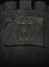
New Front Page Graphics

Which do you like best?

  • #1

    Votes: 0 0.0%
  • #2

    Votes: 0 0.0%
  • #3

    Votes: 0 0.0%
  • #4

    Votes: 0 0.0%
  • #5

    Votes: 0 0.0%
  • I don't, it looks like shite.

    Votes: 0 0.0%

  • Total voters
    0

Aeillin

Dalayan Beginner
Hello, So I was looking at the site today and decided to take it upon myself to make some new stuff, whether or not Wiz wants to use it is up to him, I was just bored and needed something to do, so here you are with a few different versions:

preview1.jpg


preview2.jpg


preview3.jpg


preview4.jpg


preview5.jpg


So, let me know what yall think, and which ones you like.

- Aeillin

P.S. Wiz, if you would like them, I do have them seperated into the same files as needed for the front page, same names, would just need to replace the images, no editing html :D
 
I was looking for which text effects people liked the most. I wanted to go for the ruin look, and this is the only one that looked good.

- Aeillin
 
I like the last one, but the 'of' needs to be higher... I would almost say floating in the center between the two words.

Just my 2p...

Otherwise really nice work Aeillin!
 
First one gets my vote, don't like the word positioning in the others.
 
Bigger text... left border to close to the bridge, if not the tower.

But then, I am no artist, and my wife would rather kill me than allow anything I like in the house.
 
Oh wow!

Thank you so much for all the feedback that you have given, it's really appreciated.

I do agree that the text could be bigger, but due to the sie restrictions of the images in question and how they fit together on the web, this is what looked the best that would not require Wiz to take the time to edit the html. I wanted to make it a drag-and-drop upgrade if he ever wanted to use them.

Then I just threw them up here to get opinions.

- Aeillin
 
A suggestion for you Aeillin...

I like the first selection, however, I would slide the text over to the left border about 2 inches or so and about a half inch up. There is a large dark area there which would contrast the text nicely and allow the bridge and its details to be revealed.

Excellent picture btw, I think it would help generate a the view of a world in ruins trying to rebuild itself and it fits very well with the lore.
 
Ok, maybe this will help. the text placement has to do with the fact that I don't feel like making it work across the frames. The size of the center frame on the layout is this big:

anilogo.png


That leaves me with not a lot of room. So currently the two best-liked are these:

anilogo3.jpg


anilogo5.jpg


Maybe now it makes a little more sense why the text is a little smaller. Personally i like it that way though. It's more unasuming, not like HEY LOOK IM SHARDS OF DALAYA OMGLOL!!!!1!!

- Aeillin

P.S. I would like to note that the texturing on the text is the same as the default original EQ UI.

P.P.S. For le plaisir des yeux, here is a mock-up of the site with the most liked of the graphic.

mockup.jpg
 
I'd just like to thank everyone for their opinions.

It's let me know some highs and lows of my work.

- Aeillin

P.S. Wiz, if by chance you want any of this, go ahead and let me know and I can zip it up and email it to you^^.
 
Either one of the two finalists would work for me. I agree that the graphic is perfect for SoD, very nice work.
 
First, I am opposed to associating someone's art with Crap2.


But while we are on the subject, did the nature of that aquaduct seem odd to anyone else who had the misfortune of playing that... game, I guess was the developer's intent, but not reality?

If I had to guess, three different people who had never met and never spoken to each other worked on three seperate pieces of it individually, and no one ever bothered to look at it or fix it afterward. The aquaduct in ... Centaur Hills ... stands as a metaphor for the game itself.
 
Back
Top Bottom