
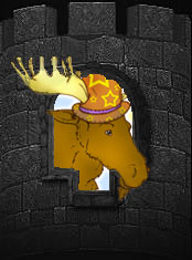
Well, this is first time I have done anything like this. My photoshop experience up to this point has been placing my daughters head on her boyfriends body and visa versa in her class picture. So I wanted some input on my new signature pic. I followed a tutorial and just changed a few things here and there. Took me quite a few hours, so please tell me what you think!
You are using an out of date browser. It may not display this or other websites correctly.
You should upgrade or use an alternative browser.
You should upgrade or use an alternative browser.
Input on signature pic
- Thread starter cats74
- Start date
bignirish88
Dalayan Adventurer
I recall there being a size limitation on signatures. i don't remember the size, but if you look around at others you should be able to get pretty close. Tarutao makes an occasion appearance and posts about it every so often. i would think about 2/3rd's of the picture size you are currently using should be about right.
Was actually looking for input on the work rather then the size, lol. I recall the limits being on avatars as they are hosted on this server. I will poke around and see if I can find something on rules for that, however am aware of at least one that has 2 pictures who's combined size is about mine, however that may be different. In any case if it does turn out it's too big I just have to try and find a way to reduce it without losing even more of the details.
bignirish88
Dalayan Adventurer
haha ok, sorry for the misinterpretation. sig looks pretty good though. nice detail
It's okay. I did look around however and could find no info on sig pic limits, so if anyone can point me to a thread (if there is one) describing limits, or if one of the staff could take a quick peek and tell me if there is a violation and what the rules are I will fix it. I don't generaly like breaking rules. Or maybe it's the consequences I don't like. Either way... Now I am rambling.
bignirish88
Dalayan Adventurer
I found it,
it's under policy plaza. it's a stickied post called forum rules. scroll down a bit and look for signature silliness, you'll see it. Mentions a 200 pixel height limit
it's under policy plaza. it's a stickied post called forum rules. scroll down a bit and look for signature silliness, you'll see it. Mentions a 200 pixel height limit
robopirateninja
Staff Emeritus
you should also change the font of your tagline, its a common mistake to choose something that looks fancy but 99% of the time a plainer font looks better. If you need to punch that line up you can do a drop shadow or fuzz up the edges if you want, but i think you should lose the curlicues
MysticAngel7777
Dalayan Adventurer
First I wanted to say that I really enjoy that the Moontree text is lit up in accordance to the moonlight ") Your color palette is allllllllmost halloween-ish with how neon they are, but it works out well.
Your color palette is allllllllmost halloween-ish with how neon they are, but it works out well.
A little "curning" will help your Moontree text stand out better - Click onto your text layer, go into your layer menu and rasterize the text (warning though, this means you wont be able to change the text after this). Now you can use your little magic wand selector on each letter (you'll probably have to remove the drop shadow first) and drag them to wherever you want (as in moving the n and t to look how you want instead of the 3 word thing that was mentioned). I'd also suggest changing the color on the bottom text so it's punchier when you shrink it down to 200 pix high.
Your color palette is allllllllmost halloween-ish with how neon they are, but it works out well.A little "curning" will help your Moontree text stand out better - Click onto your text layer, go into your layer menu and rasterize the text (warning though, this means you wont be able to change the text after this). Now you can use your little magic wand selector on each letter (you'll probably have to remove the drop shadow first) and drag them to wherever you want (as in moving the n and t to look how you want instead of the 3 word thing that was mentioned). I'd also suggest changing the color on the bottom text so it's punchier when you shrink it down to 200 pix high.
Last edited:
According to my math, that should be 200 pixels high, the total of the image and the text. Wow, this has been allot of work, but well worth it. I just need to find a place to add, in the pic, Moontree's forum site. Any suggestions? I want it to stand out. I have considered animated gif, but with the 64k limit, I think I would loose too much in detail, if it was even possible to make a decent signature with this much detail into a gif less then 64k.
Last edited:
robopirateninja
Staff Emeritus
A little "curning" will help your Moontree text stand out better - Click onto your text layer, go into your layer menu and rasterize the text (warning though, this means you wont be able to change the text after this). Now you can use your little magic wand selector on each letter (you'll probably have to remove the drop shadow first) and drag them to wherever you want (as in moving the n and t to look how you want instead of the 3 word thing that was mentioned). I'd also suggest changing the color on the bottom text so it's punchier when you shrink it down to 200 pix high.
Most text/image editors have options to kern text without rasterizing it, doing it your way seems really complicated in comparison.
MysticAngel7777
Dalayan Adventurer
Eh, makes more sense to me to learn things the "complicated" way as you put it so that I don't rely on easy button clicking for all my life skills. That and I probably have a really dilapidated version of the CS than others atm.
Reiker
Dalayan Adventurer
Eh, makes more sense to me to learn things the "complicated" way as you put it so that I don't rely on easy button clicking for all my life skills. That and I probably have a really dilapidated version of the CS than others atm.
Kerning has been available in Photoshop way before CS.