Starting a thread to house my UI files as I work on them. Some of this won't get done until January since the holidays will be busy with work and family time, but I'll update as I go.
For reference, I play at 1900x1200.
Files can be found here (right click to download): https://onedrive.live.com/redir?resid=F1701D5D326A8A1B!233&authkey=!AP_CNzgqH2CvIaU&ithint=folder,xml
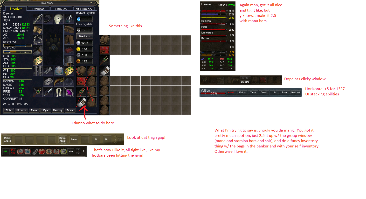
EQUI_HotButtonWnd.xml - 4 Horizontal Hot Bars. Updated from my 2.0 hot bars now, except the lower green text shows the window number and is clickable for the save/load hotbutton set functionality. See Screenshot below.
SpellGems.zip - From eqinterface at this link: http://www.eqinterface.com/downloads/fileinfo.php?id=6461
Timers do not work on the icons and no current plans to fix that.
EQUI_PetInfoWindow.xml - Horizontal pet bar (visible in 2nd screenshot). Pulled mine forward from SoD 2.0, kludged in XML to remove UI errors. No plans currently to add pet buff icons if they become a thing, but maybe.
EQUI_CastSpellWnd.xml - Horizontal spell cast bar. Pulled this together from SoD 2.0 also and kludged in XML to remove UI errors.
EQUI_ActionsWindow.xml - Horizontal Action window, which is the window above the far right hotbuttons window in the screenshot, currently on the hotkeys tab. No on screen buttons to switch to the combat or ability tabs, though they are there, I just use hot keys for that.
EQUI_Container.xml - Bags with some inventory slot icons in them, visible in the 2nd screenshot.
TO DO LIST:
Current:

2.0 UI

Hotbutton Window:

For reference, I play at 1900x1200.
Files can be found here (right click to download): https://onedrive.live.com/redir?resid=F1701D5D326A8A1B!233&authkey=!AP_CNzgqH2CvIaU&ithint=folder,xml
EQUI_HotButtonWnd.xml - 4 Horizontal Hot Bars. Updated from my 2.0 hot bars now, except the lower green text shows the window number and is clickable for the save/load hotbutton set functionality. See Screenshot below.
SpellGems.zip - From eqinterface at this link: http://www.eqinterface.com/downloads/fileinfo.php?id=6461
Timers do not work on the icons and no current plans to fix that.
EQUI_PetInfoWindow.xml - Horizontal pet bar (visible in 2nd screenshot). Pulled mine forward from SoD 2.0, kludged in XML to remove UI errors. No plans currently to add pet buff icons if they become a thing, but maybe.
EQUI_CastSpellWnd.xml - Horizontal spell cast bar. Pulled this together from SoD 2.0 also and kludged in XML to remove UI errors.
EQUI_ActionsWindow.xml - Horizontal Action window, which is the window above the far right hotbuttons window in the screenshot, currently on the hotkeys tab. No on screen buttons to switch to the combat or ability tabs, though they are there, I just use hot keys for that.
EQUI_Container.xml - Bags with some inventory slot icons in them, visible in the 2nd screenshot.
TO DO LIST:
1) Combined Player/Group window. I plan on making a combined player and group window similar to the one shown in the 2nd screenshot. This will be a bit of work so probably not ready till January when I have some more free time.
- Move the invite/disband buttons off of player window as it was in my old 2.0 UI, possibly to hotbutton window 4
2) Tweak song buff window.
3) Target Window - ???? waiting to see how it looks with HOTT.
3) Target Window - ???? waiting to see how it looks with HOTT.
Current:

2.0 UI

Hotbutton Window:

Last edited:


