Meeil
Dalayan Elder
ClickSwap4
https://drive.google.com/file/d/1mABJGhAx19VbvDLf4_duXomryBeRQTDx/view?usp=sharing
ClickSwap5
https://drive.google.com/file/d/1Oo6L0MYD12XRHJHePuS-9ItfEzcWuWWv/view?usp=sharing
ClickSwap5
Revamped HotButton Bar 1 - All Equip Spots now on row 1 each tab (more stuff to swap out) - Window and Buttons 10% larger, now whole window mimics the size of the party window, more cohesiveness.
New Action Window (old one in backup directory) - Larger buttons, easier to read
Changed default Compass
More item window fixes. should be all done now
optional 9 song song window (old one in backup folder)
New Horizontal Spellbar (old one in backup folder)
New Target rings, easy to see.
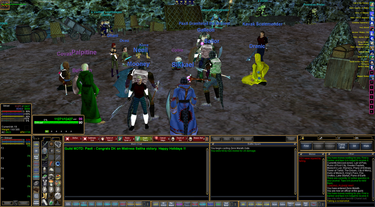
ClickSwap has a plethora of in-bag inventory slots next to common wearable items for click-swapping on the fly without opening bags or your inventory.
Everyone will have different clickies in different locations, it is hard to please everyone.
It also constantly changes, if you like it to change for your toon,
you may want to learn to modify it.
Vitali has an old post on it, which is still relevant in today's SoD 2.5 if interested in modding for your character.
https://shardsofdalaya.com/forum/threads/hotkeys-your-ui-and-you.27769/
however, some of the inventory item assignments have been altered since 2.5, this doesn't just affect my ui, but all.
here is a pic of the current build ui assignments.
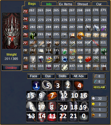
(COPIED OVER FOR REFERENCE)
Charm Slot---------------------A_InvCharm
Left Ear Slot-------------------A_InvEar
Head Slot----------------------A_InvHead
Face Slot-----------------------A_InvFace
Right Ear Slot-----------------A_InvEar
Neck Slot-----------------------A_InvNeck
Shoulder Slot------------------A_InvShoulders
Arms Slot----------------------A_InvArms
Back Slot-----------------------A_InvAboutBody
Left Wrist Slot----------------A_InvWrist
Right Wrist Slot---------------A_InvWrist
Range Slot---------------------A_InvRange
Hands Slot---------------------A_InvHands
Primary Slot-------------------A_InvPrimary
Secondary Slot-----------------A_InvSecondary
Left Finger Slot---------------A_InvRing
Right Finger Slot--------------A_InvRing
Chest Slot---------------------A_InvChest
Legs Slot----------------------A_InvLegs
Feet Slot----------------------A_InvFeet
Waist Slot---------------------A_InvWaist
Ammo Slot----------------------A_InvAmmo
Main Inventory Slot 1----------A_RecessedBox
Main Inventory Slot 2----------A_RecessedBox
Main Inventory Slot 3----------A_RecessedBox
Main Inventory Slot 4----------A_RecessedBox
Main Inventory Slot 5----------A_RecessedBox
Main Inventory Slot 6----------A_RecessedBox
Main Inventory Slot 7----------A_RecessedBox
Main Inventory Slot 8----------A_RecessedBox
https://drive.google.com/file/d/1mABJGhAx19VbvDLf4_duXomryBeRQTDx/view?usp=sharing
ClickSwap5
https://drive.google.com/file/d/1Oo6L0MYD12XRHJHePuS-9ItfEzcWuWWv/view?usp=sharing
ClickSwap5
Revamped HotButton Bar 1 - All Equip Spots now on row 1 each tab (more stuff to swap out) - Window and Buttons 10% larger, now whole window mimics the size of the party window, more cohesiveness.
New Action Window (old one in backup directory) - Larger buttons, easier to read
Changed default Compass
More item window fixes. should be all done now
optional 9 song song window (old one in backup folder)
New Horizontal Spellbar (old one in backup folder)
New Target rings, easy to see.

ClickSwap has a plethora of in-bag inventory slots next to common wearable items for click-swapping on the fly without opening bags or your inventory.
Everyone will have different clickies in different locations, it is hard to please everyone.
It also constantly changes, if you like it to change for your toon,
you may want to learn to modify it.
Vitali has an old post on it, which is still relevant in today's SoD 2.5 if interested in modding for your character.
https://shardsofdalaya.com/forum/threads/hotkeys-your-ui-and-you.27769/
however, some of the inventory item assignments have been altered since 2.5, this doesn't just affect my ui, but all.
here is a pic of the current build ui assignments.

(COPIED OVER FOR REFERENCE)
Charm Slot---------------------A_InvCharm
Left Ear Slot-------------------A_InvEar
Head Slot----------------------A_InvHead
Face Slot-----------------------A_InvFace
Right Ear Slot-----------------A_InvEar
Neck Slot-----------------------A_InvNeck
Shoulder Slot------------------A_InvShoulders
Arms Slot----------------------A_InvArms
Back Slot-----------------------A_InvAboutBody
Left Wrist Slot----------------A_InvWrist
Right Wrist Slot---------------A_InvWrist
Range Slot---------------------A_InvRange
Hands Slot---------------------A_InvHands
Primary Slot-------------------A_InvPrimary
Secondary Slot-----------------A_InvSecondary
Left Finger Slot---------------A_InvRing
Right Finger Slot--------------A_InvRing
Chest Slot---------------------A_InvChest
Legs Slot----------------------A_InvLegs
Feet Slot----------------------A_InvFeet
Waist Slot---------------------A_InvWaist
Ammo Slot----------------------A_InvAmmo
Main Inventory Slot 1----------A_RecessedBox
Main Inventory Slot 2----------A_RecessedBox
Main Inventory Slot 3----------A_RecessedBox
Main Inventory Slot 4----------A_RecessedBox
Main Inventory Slot 5----------A_RecessedBox
Main Inventory Slot 6----------A_RecessedBox
Main Inventory Slot 7----------A_RecessedBox
Main Inventory Slot 8----------A_RecessedBox
Last edited:
