Kedrin
Dalayan Pious Diety
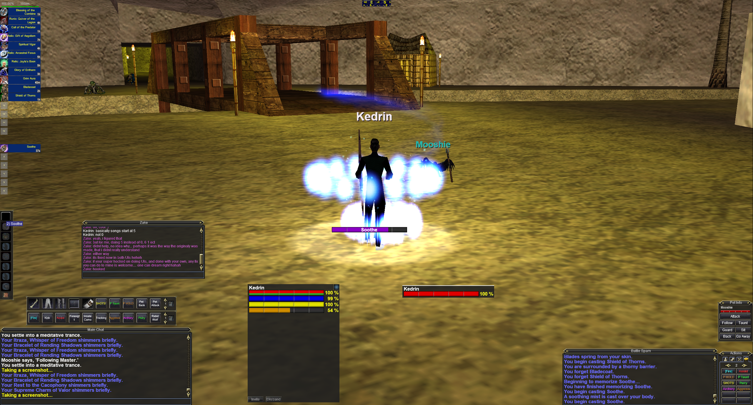
Here is a picture my old UI I used for old SoD (2.0?):
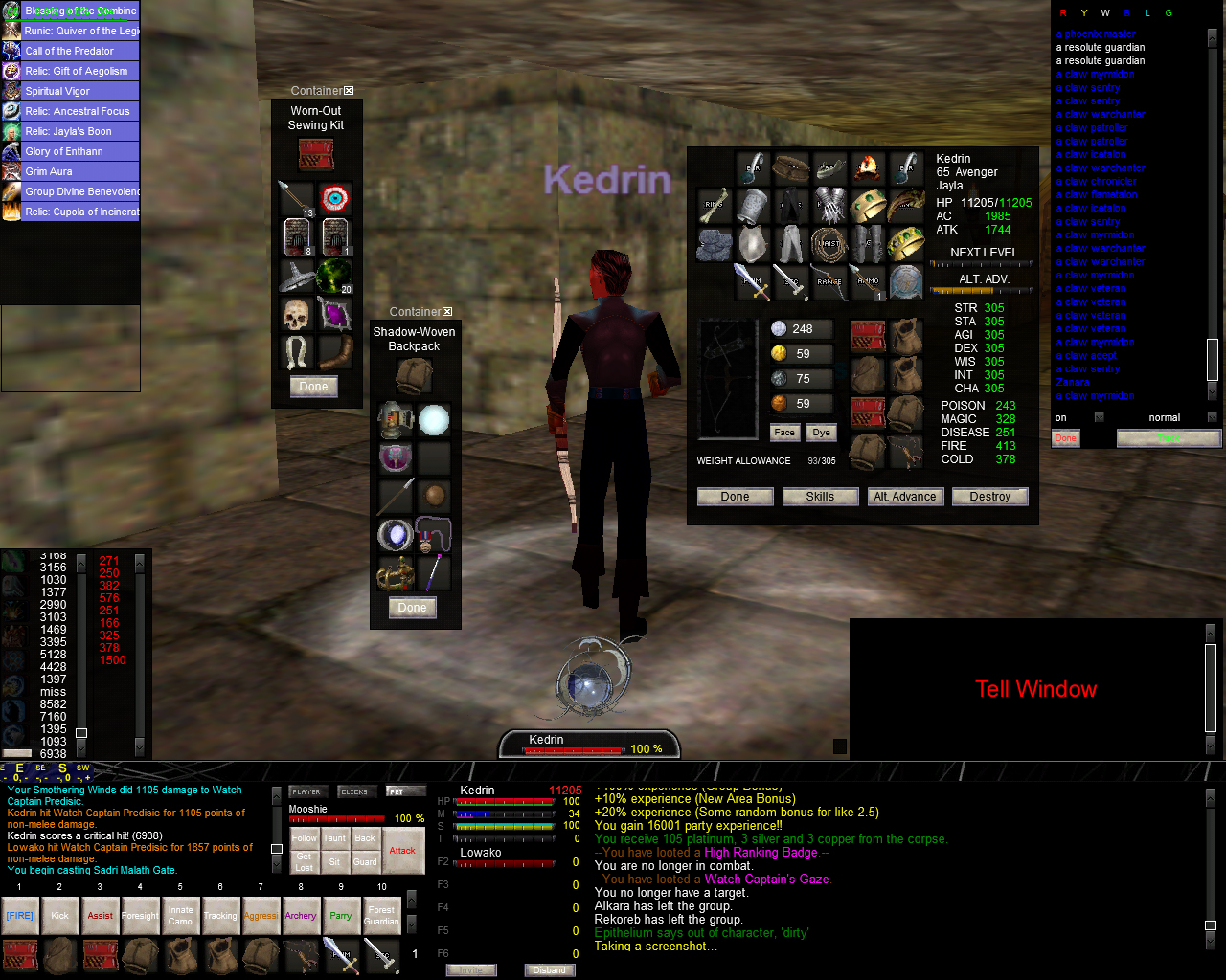
Currently one of the main things holding me back from enjoying my time on 2.5 is simply due to the UI being so terrible.
I haven't had too much free time. However, I am trying to make a UI for 2.5.
Just felt like showing you guys what I have made so far. Maybe you guys can give me some good ideas.
I am shooting for something similar to my old UI but working on cleaning up some of the things I was always too lazy to fix / work on.
I know my screen resolution is terrible (1280 x 1024). My PC currently isn't the best. I hope to get one soon so I can play at a better resolution, perhaps 2560 x 1440 if SoD even can handle it. If you are running this resolution let me know.
Buffs & Effects
I have always been a fan of Soes's work on EQ Interface since I played live from way back in the day. I pulled out this file from 09-30-2003 to see if I could edit it and make it work.
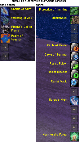
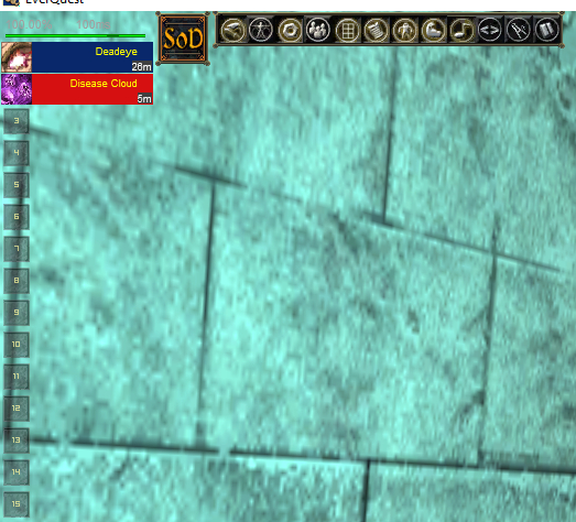
I like to have my buffs on the left side of my screen over having them on my right. I use the right side for the tracking window. Anyhow, here are some pictures of the progression. This took my FAR too long. It was embarrassing. Had to edit the EQUI_Animations file.
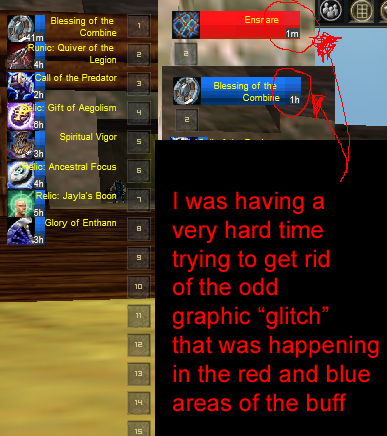
Finally, I figured out of to fix it:
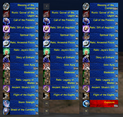
Added the other buff's to the window to no longer get the error when logging in / zoning as well.
Not 100% sure I like the blue texture I used. It seems a bit too flashy. I do like the red one however.
Selector window
Edited "Simple Sleek Selector Window" found Here to work better with SoD
Basically the following buttons are worthless for SoD so I removed them:
Combat Skills
Journal
Mercenaries
Mail
Help
I left Guild Window in there in hopes it will one day it will work.

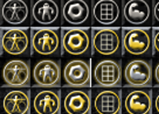
Also, there is an odd bug I ran into that three buttons are one pixel off when they are selected and you hover over them.
You will have to edit the "window_pieces02" file in your UI folder to fix this. Shifting the three buttons over one pixel will fix this problem. Shown here:
Breath Window

Casting Window

Compass


Currently one of the main things holding me back from enjoying my time on 2.5 is simply due to the UI being so terrible.
I haven't had too much free time. However, I am trying to make a UI for 2.5.
Just felt like showing you guys what I have made so far. Maybe you guys can give me some good ideas.
I am shooting for something similar to my old UI but working on cleaning up some of the things I was always too lazy to fix / work on.
I know my screen resolution is terrible (1280 x 1024). My PC currently isn't the best. I hope to get one soon so I can play at a better resolution, perhaps 2560 x 1440 if SoD even can handle it. If you are running this resolution let me know.
Buffs & Effects
I have always been a fan of Soes's work on EQ Interface since I played live from way back in the day. I pulled out this file from 09-30-2003 to see if I could edit it and make it work.
I like to have my buffs on the left side of my screen over having them on my right. I use the right side for the tracking window. Anyhow, here are some pictures of the progression. This took my FAR too long. It was embarrassing. Had to edit the EQUI_Animations file.

Finally, I figured out of to fix it:

Added the other buff's to the window to no longer get the error when logging in / zoning as well.
Not 100% sure I like the blue texture I used. It seems a bit too flashy. I do like the red one however.
Selector window
Edited "Simple Sleek Selector Window" found Here to work better with SoD
Basically the following buttons are worthless for SoD so I removed them:
Combat Skills
Journal
Mercenaries
Help
I left Guild Window in there in hopes it will one day it will work.

Also, there is an odd bug I ran into that three buttons are one pixel off when they are selected and you hover over them.
You will have to edit the "window_pieces02" file in your UI folder to fix this. Shifting the three buttons over one pixel will fix this problem. Shown here:

Breath Window

Casting Window

Compass

Last edited:
